

This post is about creating Responsive tables using minimal css and html. No, i am not talking about using <table> tag in html. So, how do we create then? We have our helpers flexbox, grid , some uncommon awesome css property and html attribute.
We are going to build a sample app for this demo. It can be applicable to any front-ends but for now, I'm sticking with Angular.
Final Outcome:
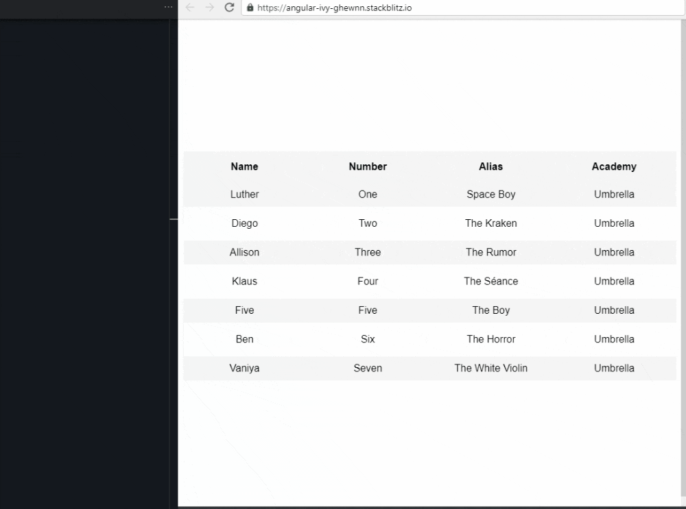
For demonstration, i've took sample object/json containing the data from here.
Let's start,
<div class="container">
     <div class="table">
         <div class="contentHeader">
             <div class="header">Name</div>
             <div class="header">Number</div>
             <div class="header">Alias</div>
             <div class="header">Academy</div>
         </div>
             <div class="contentListRow" *ngFor="let content of members">
                 <div class="contentRow">{{ content.name }}</div>
                 <div class="contentRow">{{ content.number }}</div>
                 <div class="contentRow">{{ content.alias }}</div>
                 <div class="contentRow">{{ content.academy }}</div>
             </div>
     </div>
</div>
In the above html,we are just iterating thru every member from members object and displaying it!
Quick look into other css classes in the above html,
`.container- centers the table in the center of the web-page.`.table- acts as container for table to take advantage of full-width of the web-page.`.contentHeader- acts as header containing the headings of the columns in the table.`.contentListRow- styling for every single row.
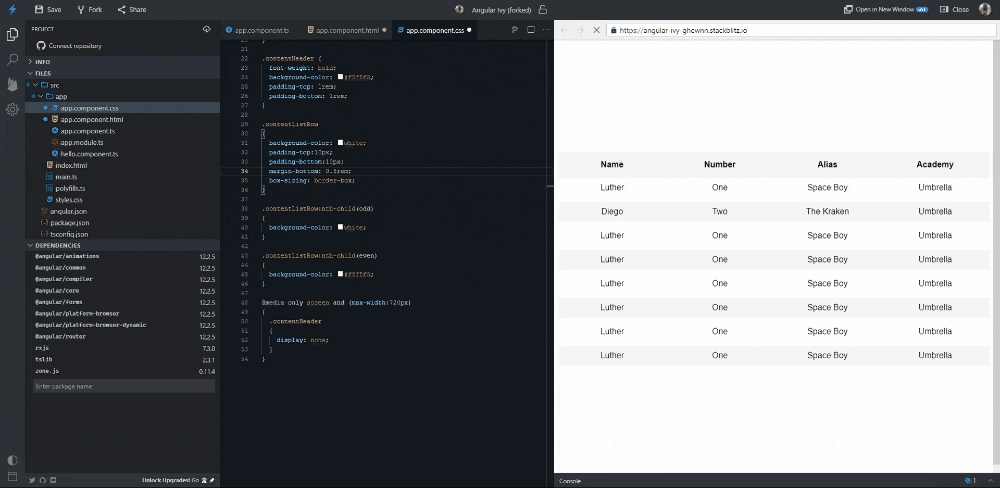
If you want to see all the styles in action, check out this stackblitz
Creating table for larger Screen size
.contentHeader,
.contentListRow {
 display: grid;
 grid-template-columns: 1fr 1fr 1fr 1fr;
}
we are going to use the grid layout in order to display table by splitting columns into 4. And KABOOM, table for the large screen Ready!
Creating table for smaller Screen size
@media only screen and (max-width: 720px) {}
1. Hiding Headers
Hiding .ContentHeader by using display:none;.
2. Showing Headers data-* attribute in HTML
- data-* attribute in html is used for storing additional info that doesn't have any visual representation. You can learn more about it in MDN
data-* attribute?
- First thing, we are going to add it to every div which has a class
contentRowon it.
After adding, It looks like the below code.
<div class="contentListRow" *ngFor="let content of members">
     <div class="contentRow" data-name="Name">{{ content.name }}</div>
    <div class="contentRow" data-name="Number">{{ content.number }}</div>
    <div class="contentRow" data-name="Alias">{{ content.alias }}</div>
    <div class="contentRow" data-name="Academy">{{ content.academy }}</div>
</div>
Notice here, we have used same data-name , why?
Here's what we gonna do..
::beforeto displaydata-namein html.contentproperty inside::beforeto show the data-name.attr()to get data-name value from html Learn more about ::before, content and attr)!
.contentListRow {
     display: flex;
     flex-direction: column;
}
.contentRow {
     display: grid;
     text-align: left;
     grid-template-columns: 1fr 1fr;
}
.contentRow::before {
     margin-left: 25%;
       content: attr(data-name);
}
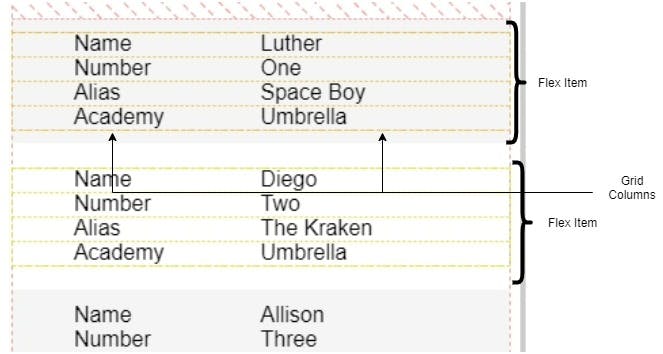
.contentListRow as flex To make it look like single column table!
.contentRow as grid to split them into two columns.
We used css grid to split ::before and contentRow values, is it possible?
Pseudo-elements are considered child elements in a grid container (just like in a flex container). Therefore, they take on the characteristics of grid items. [src: stackoverflow].
That's it!!!
TL;DR
For Larger Screens,
- Use Grid for larger screens (3 or more columns)
For Smaller Screens,
- Use Flexbox for small screens (flex-direction: column)
- data-* attribute in HTML for every field in the table
- ::before for every field in the table
- content: attr(data-name) in ::before pseudo-element of the field
Check out the live app + code here at this stackblitz
Thanks for reading if you've read this far!! Open for any suggestions for this post.
You can contact me at twitter!